
Bitossi Pottery Guide: Aldo Londi & Rimini Blu Ceramics
Identify Bitossi ceramics from Montelupo: Guido Bitossi 1921, Aldo Londi’s Rimini Blu from 1959, Sottsass collaboration, and archive clues for collectors.
Bitossi Pottery: Aldo Londi, Rimini Blu and Montelupo Design
Bitossi is the Montelupo Fiorentino manufactory mid-century collectors recognise as vivid blue vases, zoomorphic vessels and sculptural lamps. The factory sits in a town whose clay culture is medieval; the modern company begins with Guido Bitossi in 1921. Post-war artistic direction under Aldo Londi created the export look still called “Bitossi blue.”
Compare earlier Tuscan tin-glaze traditions in Deruta ceramics and Faenza maiolica—different technology, same region’s long ceramic memory.
1921 manufactory, 1950s redesign
Company history published by Bitossi Ceramiche describes Guido Bitossi’s Manifattura Maioliche Artistiche as a bridge between local maiolica habit and contemporary style. The decisive modern chapter opens when Londi—painter, sculptor and ceramist born in Montelupo in 1911—becomes artistic director and collaborates with the firm for more than fifty years.
In that climate Ettore Sottsass began working with Bitossi in 1955, joining industrial design method to workshop skill. The Fondazione Vittoriano Bitossi’s industrial archive, musealised for the 2021 centenary in the 1929 historic plant, preserves thousands of forms, plasters and documents that make those collaborations traceable.
Rimini Blu (from 1959)
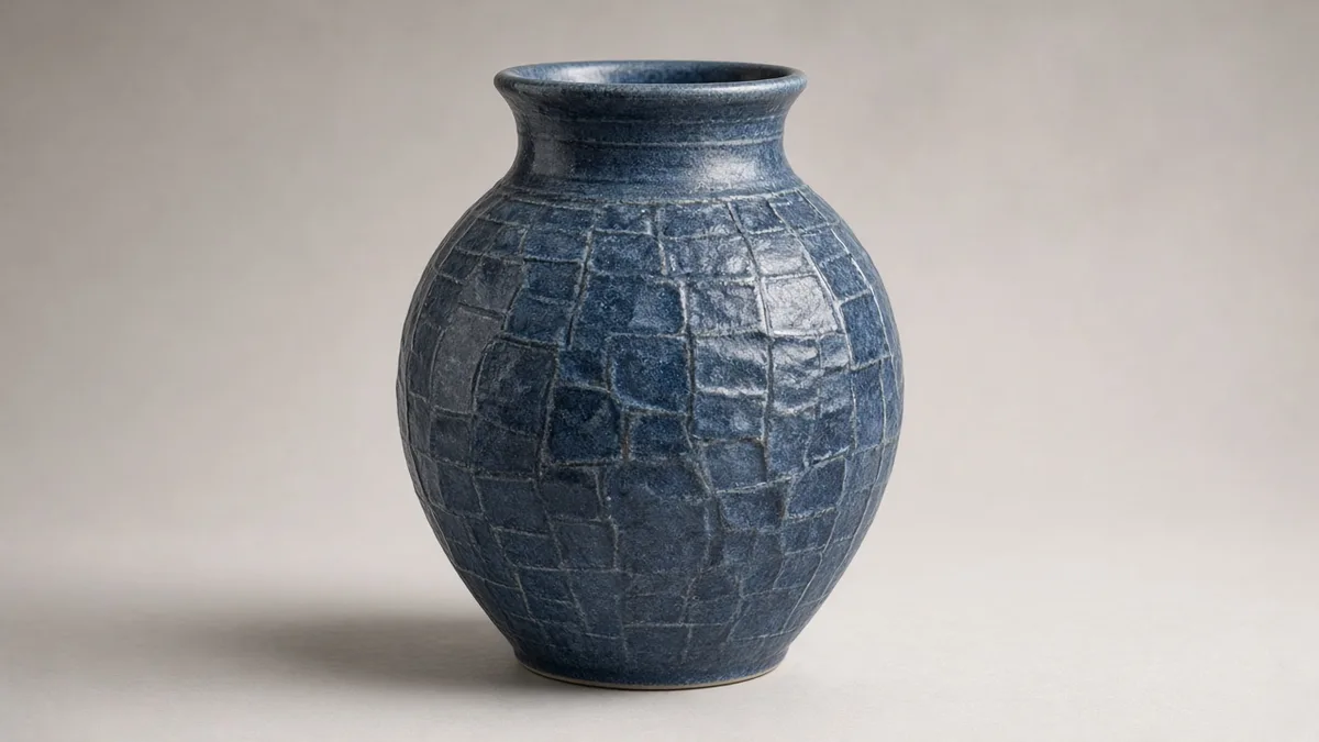
Rimini Blu, designed by Londi and produced continuously since 1959, is the signature series. Bitossi describes stamped geometric motifs in the clay skin, quick colour accents fixed under a luminous blue crystalline glaze that evokes light on water. The name honours the Romagna Riviera—already a destination for international tourism in the 1950s.
Handmade production remains central in company statements: turning or moulding, hand-stamped décor, glaze and firing at Montelupo. Re-editions of archive Londi pieces can carry inventory numbers from the Archivio Museo; period pieces lack those modern archive stamps.
How collectors should look
1. Colour and texture: Rimini Blu combines incised/stamped pattern with deep blue crystalline—not a flat spray blue.
2. Base evidence: look for Bitossi / Montelupo / Cav. G. Bitossi & Figli labels or painted marks; photograph before washing.
3. Weight and finish: studio pottery heft and glaze pooling beat resin-heavy tourist copies.
4. Design family: Londi’s animals, bottles and lamps share a sculptural silhouette language beyond any single blue glaze.
5. Archive vs period: riedizioni cite archive inventory numbers; treat them as authorised revivals, not 1959 originals.
FAQ
Is Bitossi the same as Raymor?
Raymor was a major mid-century importer/distributor of Italian ceramics. “Raymor” stickers identify a sales channel, not a Montelupo clay body by themselves.
When does Rimini Blu start?
1959, still in production according to the manufactory.
Where is the reference collection?
Archivio Museo Bitossi / Fondazione Vittoriano Bitossi, via Gramsci, Montelupo Fiorentino.
Conclusion
Bitossi identification is a Montelupo modern design problem: 1921 founding, Londi’s post-war direction, Rimini Blu from 1959, and archive-backed forms. Read glaze texture and marks before accepting any blue Italian vase as Bitossi.
Montelupo before Bitossi modern
Montelupo’s clay economy is centuries deep; Bitossi’s 1921 manufactory inherits that workshop density even when the style turns modern. Early artistic maiolica from the firm is not the same product as Londi’s post-war sculptural line. When a listing says only “Bitossi Italy,” ask which language of form you are buying: historicism, 1950s research glaze, or contemporary re-edition.
The Archivio Museo’s scale—thousands of catalogued ceramics plus drawings—means parallels exist for many Londi shapes. Use that fact as a research invitation, not as a claim that every blue vase is documented.
Sottsass and the design turn
Sottsass’s collaboration from 1955 matters because it shows Bitossi as a design laboratory, not only a souvenir pottery. Totemic stacks and experimental glazes in the archive narrative sit beside Rimini Blu’s more commercial success. Collectors should not force every abstract Bitossi piece into the Rimini Blu label; wrong series names hurt both scholarship and resale.
Export stickers and distribution
Mid-century interiors often met Bitossi through importers. Paper labels naming distributors can be original marketing evidence; they are not clay marks. Remove nothing until photographed. A missing label does not disqualify a piece; a glossy new “Bitossi” sticker on a cold moulded body should raise suspicion.
Condition
Crystalline glazes can show pooling and freckling that are part of the look. Distinguish those from impact chips on rims and base rings. Drill holes for lamps are common on vases converted to lighting; disclose them. Restoration over blue glaze is hard to hide in daylight—inspect outdoors or under a bright neutral lamp.
Reading Londi without mythology
Aldo Londi's long collaboration resists short slogans. Company pages describe painter, sculptor and ceramist roles; Rimini Blu is one outcome of decades of glaze research with industrial partners such as Colorobbia. Saying "Londi blue" for every turquoise Italian vase erases that research history.
Fondazione materials emphasise continuity of site: the 1929 building still frames archive and museum narratives. When a piece claims Bitossi but shows none of the hand-stamped skin or crystalline depth associated with Rimini Blu, either it is another Bitossi series or it is not Bitossi. Both conclusions are respectable if argued from the object.
Cross-check furniture-adjacent décor (lamps, room dividers) against construction: ceramic modules rewired for local voltage may be honest mid-century exports with later fittings—disclose the fittings.